<img height="1" width="1" style="display:none;" alt="" src="https://dc.ads.linkedin.com/collect/?pid=319290&amp;fmt=gif">
Brand Book _hero Image

NAIFA Marketing
Brand Manual

Identity Overview


The establishment of a uniform brand image should be a paramount concern for any organization.

Broad recognition of NAIFA’s brand image is directly tied to our success. It is important for the NAIFA federation to commit to establishing brand imagery and sticking to its basic themes—e.g., use the same colors, shapes, pictures—over time. Brand imagery becomes ingrained in the mind of the audience and helps advance NAIFA’s success.

These guidelines show the correct usage of the NAIFA logo and brand identity. This identity is how people recognize and know us. It represents everything, from the organization as a whole to our individual offices. It is how we set ourselves apart from our competitors. It is very important that we remain consistent in all forms of communication.

Correct usage of the NAIFA identity provides credibility for the association. To ensure the proper usage, we’ve established a few simple guidelines to be followed in all communications efforts.

NAIFA BRAND IDENTITY COLORS

#0066CC

#3E95D1

#3E4476

#E5F4FF

#5ABE78

#4583B6

#F5F4DE

#D37E3E

#2F3998

#4E5077

#E1A571

#AA4A24

#4F58A7

#DC7D4F

#DBB725

#56C3BD

#4455A5

#496BB3

#193E58

#64C7C4

#195C91

#DB5450

#D9DE22

#8D9236

ADVOCACY OFFICIAL

#D71E3E

Official Logo


New NAIFA-3

Download Logo Set

New: Tri-logo


New NAIFA-3

Download Logo Set

State Logos

All guidelines for the NAIFA logo extend to logos for NAIFA’s State, Local and Regional associations. The name of the state, city or region appears below the NAIFA logo. No other elements or colors may be added to State, Local or Regional association logos.

VIEW ALL

Typography

Fonts


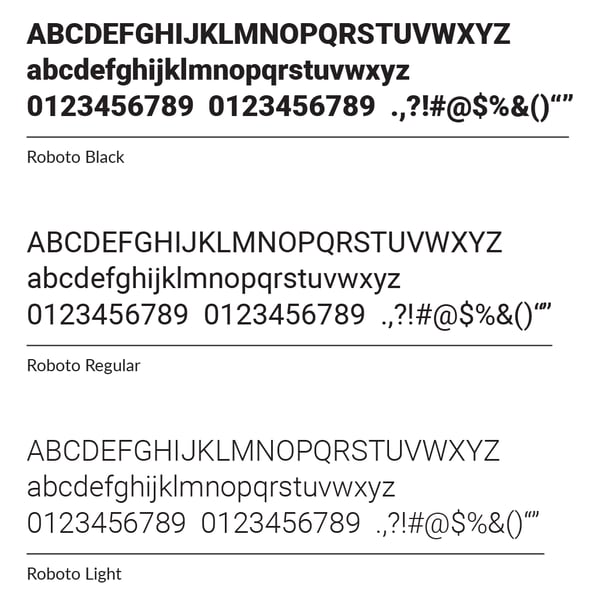
ROBOTO FONT

This is the primary typeface for headlines (uppercase), titles, and call-to-action buttons.
It can also be utilized for section heads or limited narrative text that requires emphasis (i. e. section introductions, pull quotes).

Download font

robotofont


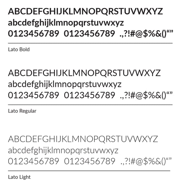
LATO FONT
This is the secondary font and is utilized for body copy, narrative text, lists, and captions. Limited use for headlines, section introductions, and pull quotes is acceptable.

Download font

latofont


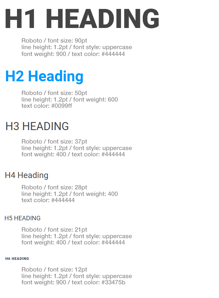
Web Styles

webfontstyles

Letterhead Format

Font: Roboto
Main heading Font-size: 20pt
Address on footer Font-size: 9pt
Text color: #000000

Envelope Format

Font: Roboto
Main heading Font-size: 20pt
Address Font-size: 6pt
Text color: #000000